


EDITORIAL/TYPOGRAPHY | ILLUSTRATION
MODERN | ARTSY
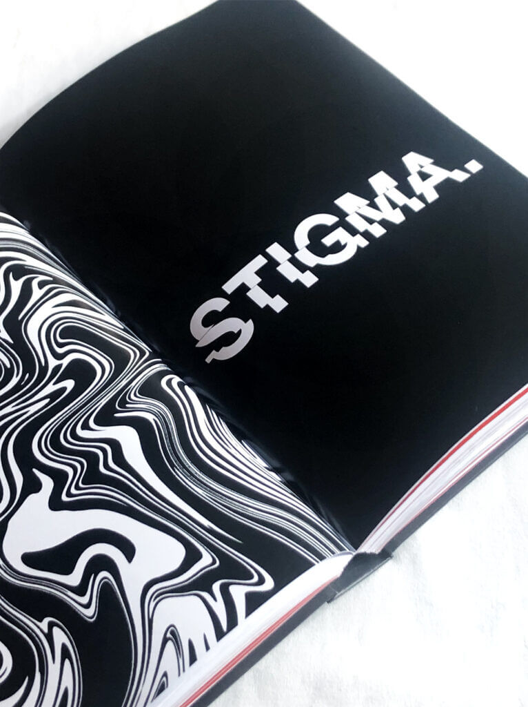
The following project was created as part of a bachelor thesis and deals with the field of exhibition design in connection with the human psyche. It dives deeper into the human social structure in which mental illnesses are stigmatized and taboo and tries to find out how this taboo and stigmatization can be reduced or prevented by means of design in the course of an exhibition and how more awareness and understanding can be created in society.
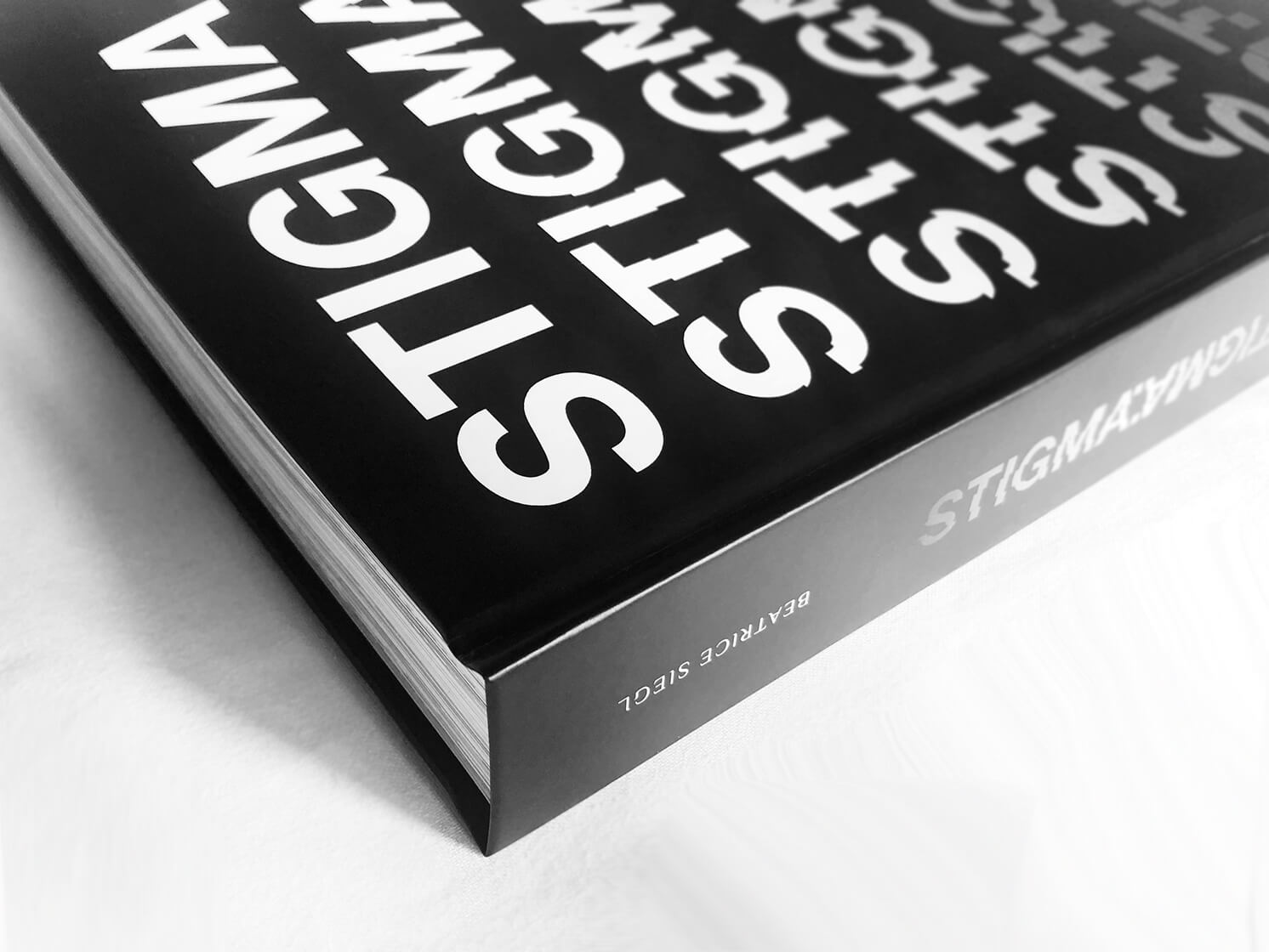
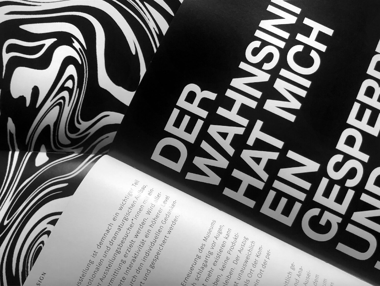
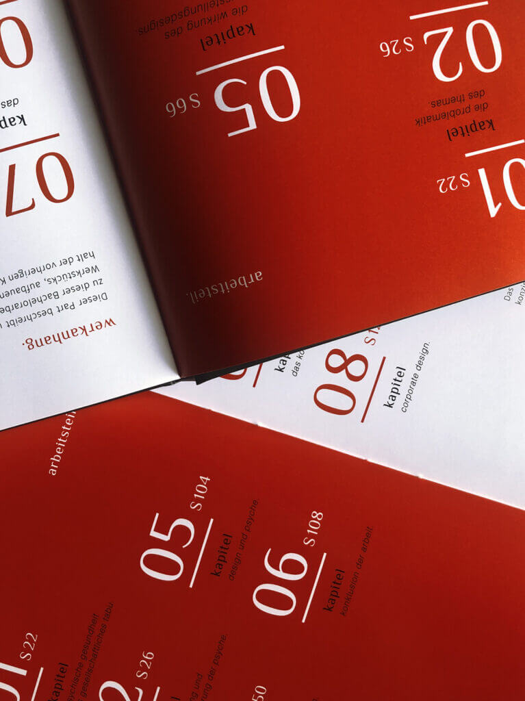
After an initial discussion of how society deals with the subject of the psyche, there follows an overview of the most important technical terms used in exhibition design, sub-areas of psychology and an explanation of how design and psyche can be connected. The corporate design created especially for the bachelor thesis already reflects this in the cover and also in the numerous pages of the book.
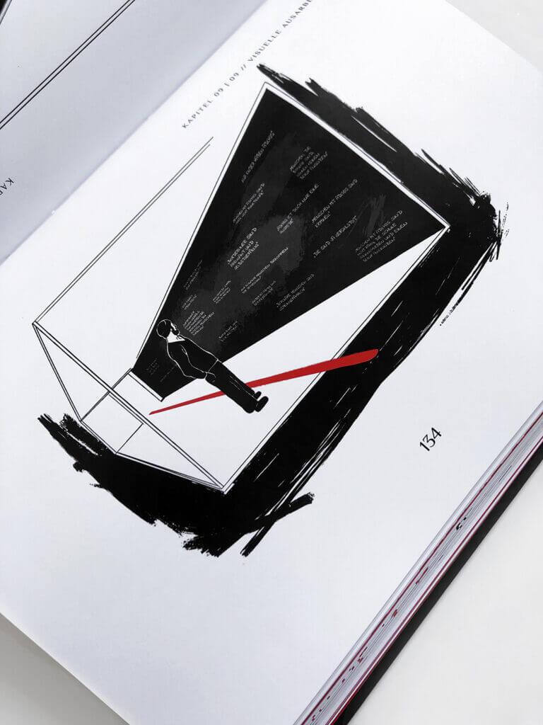
Thus, on the theoretical part, the basis for the practical part of the work, a visualization and conceptual execution of an exhibition design on the topic of "mental illnesses", could be created. In the practical part in the middle of the book, one particular of the many rooms of the exhibition design is shown, sketched and illustrated in more detail and the corporate design is also used here.
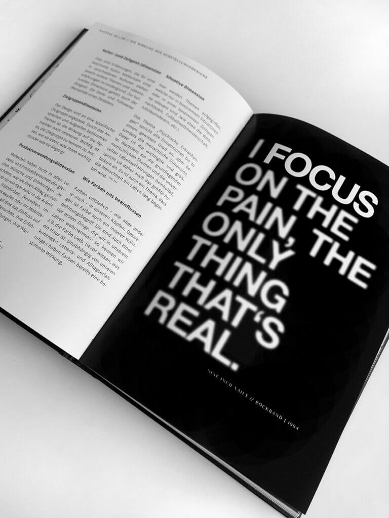
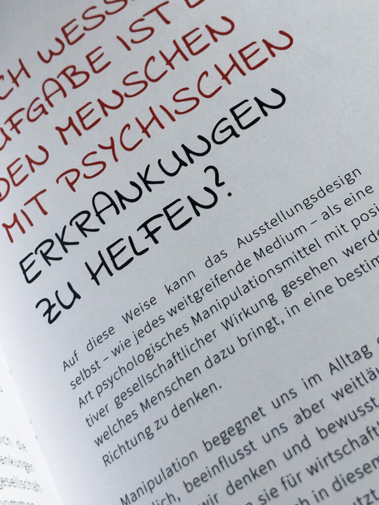
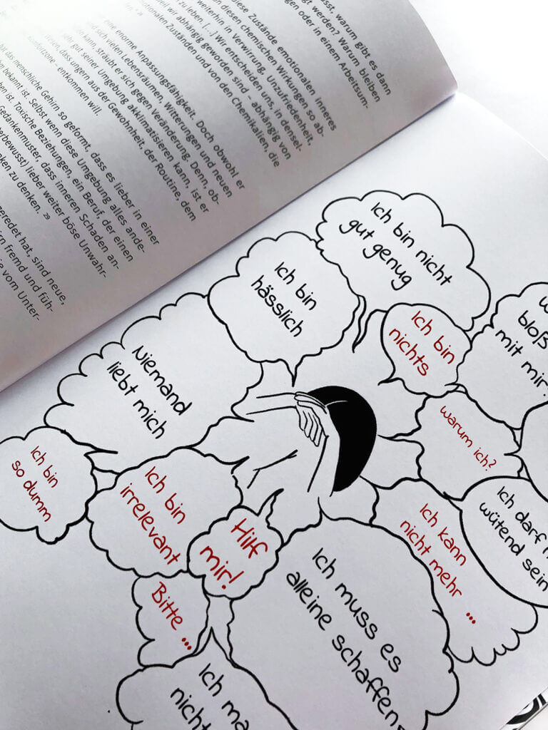
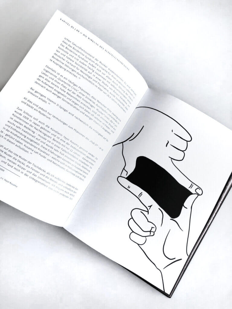
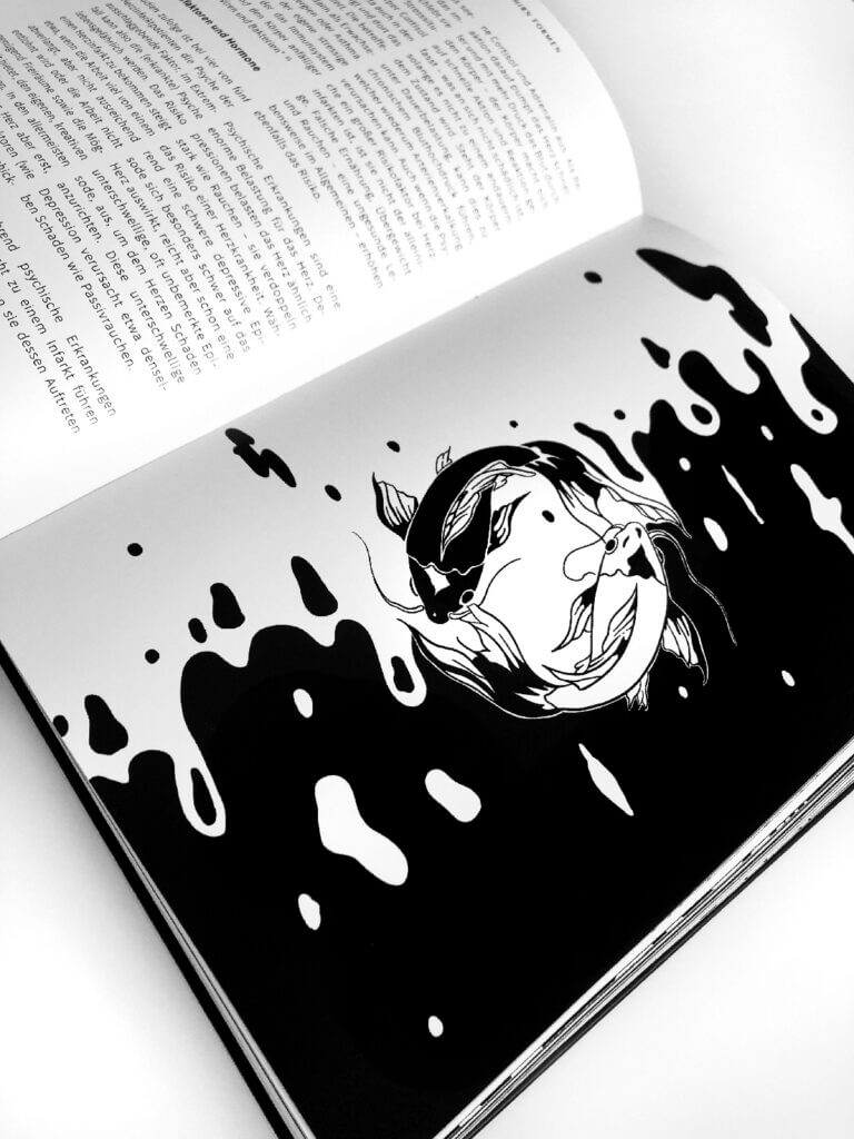
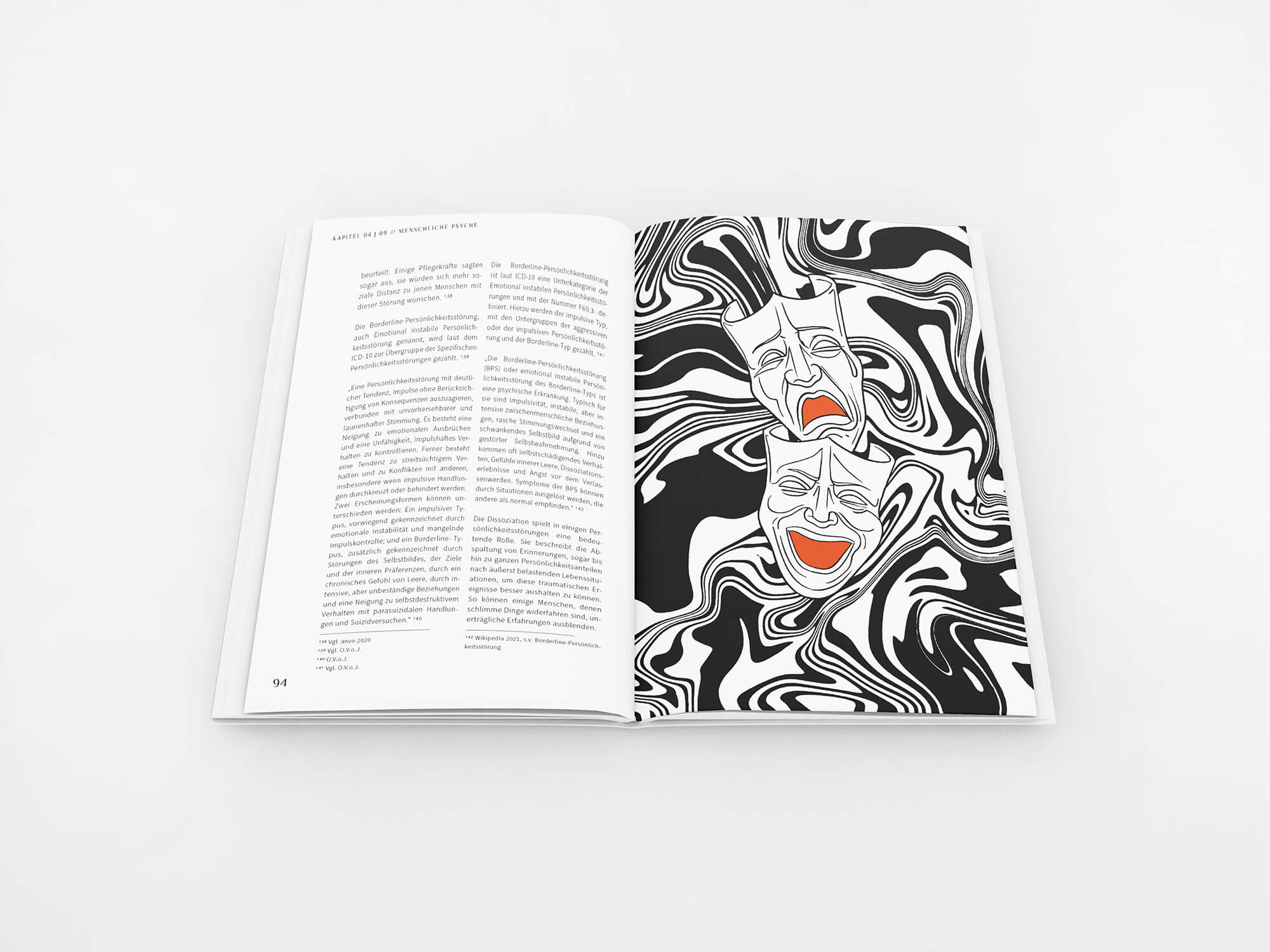
First and foremost, the book and the exposition with its design handles the topic of stigmatization as a serious problem in society. In addition, individual mental illnesses such as depression, AD(H)D or bipolar disorder are discussed. Their emergence and impact on the lives of affected people and their environment, the typical behavioral characteristics of these clinical mental illnesses and the current treatment options are also discussed. Furthermore, the self-perception and also the attitude of other people to mental illnesses are addressed. Different subject areas are explained and illustrated using individual exhibits. The main statement can be conveyed to the audience even more intensively through its interactive use.
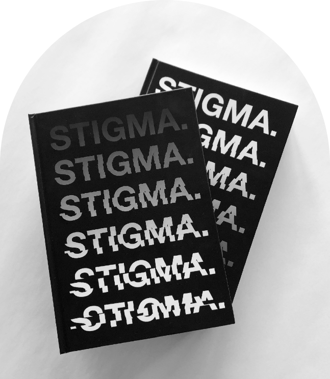
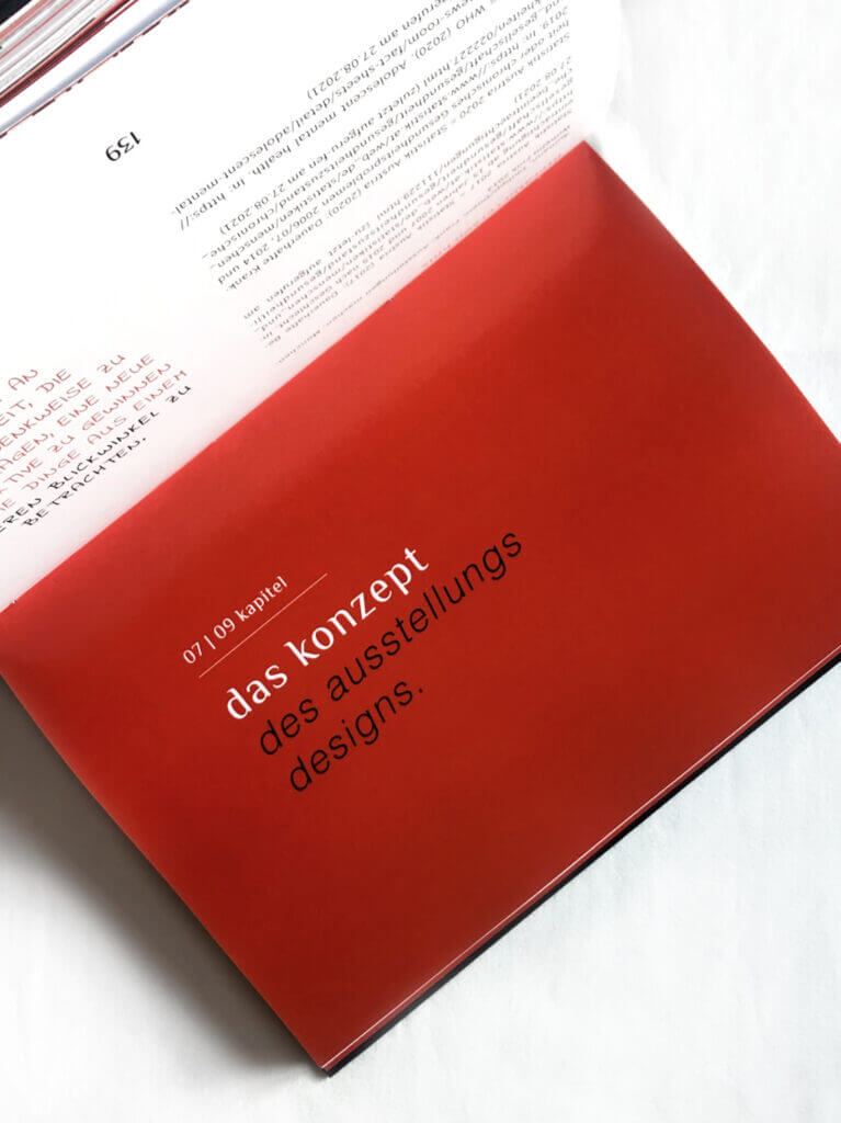
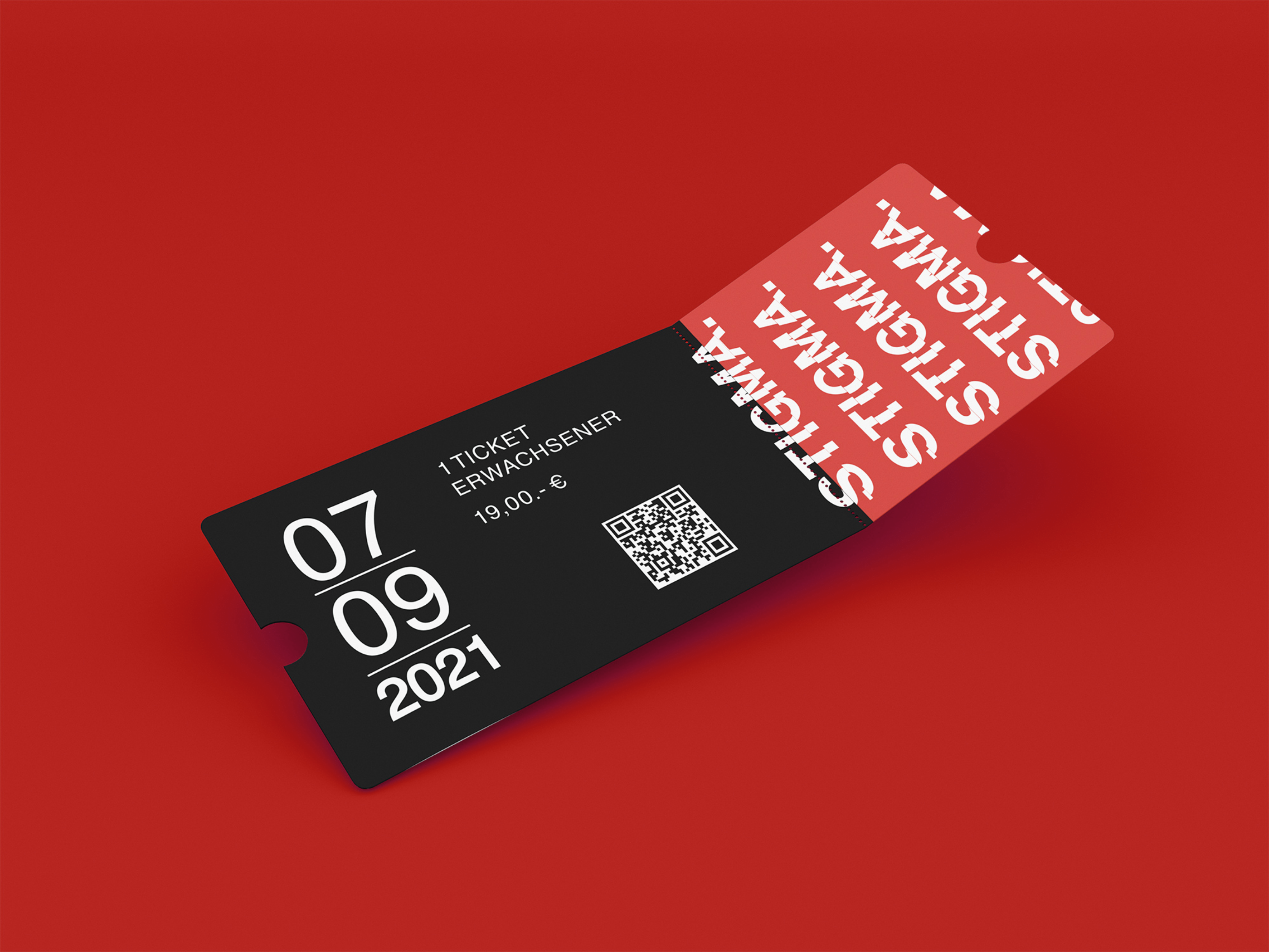
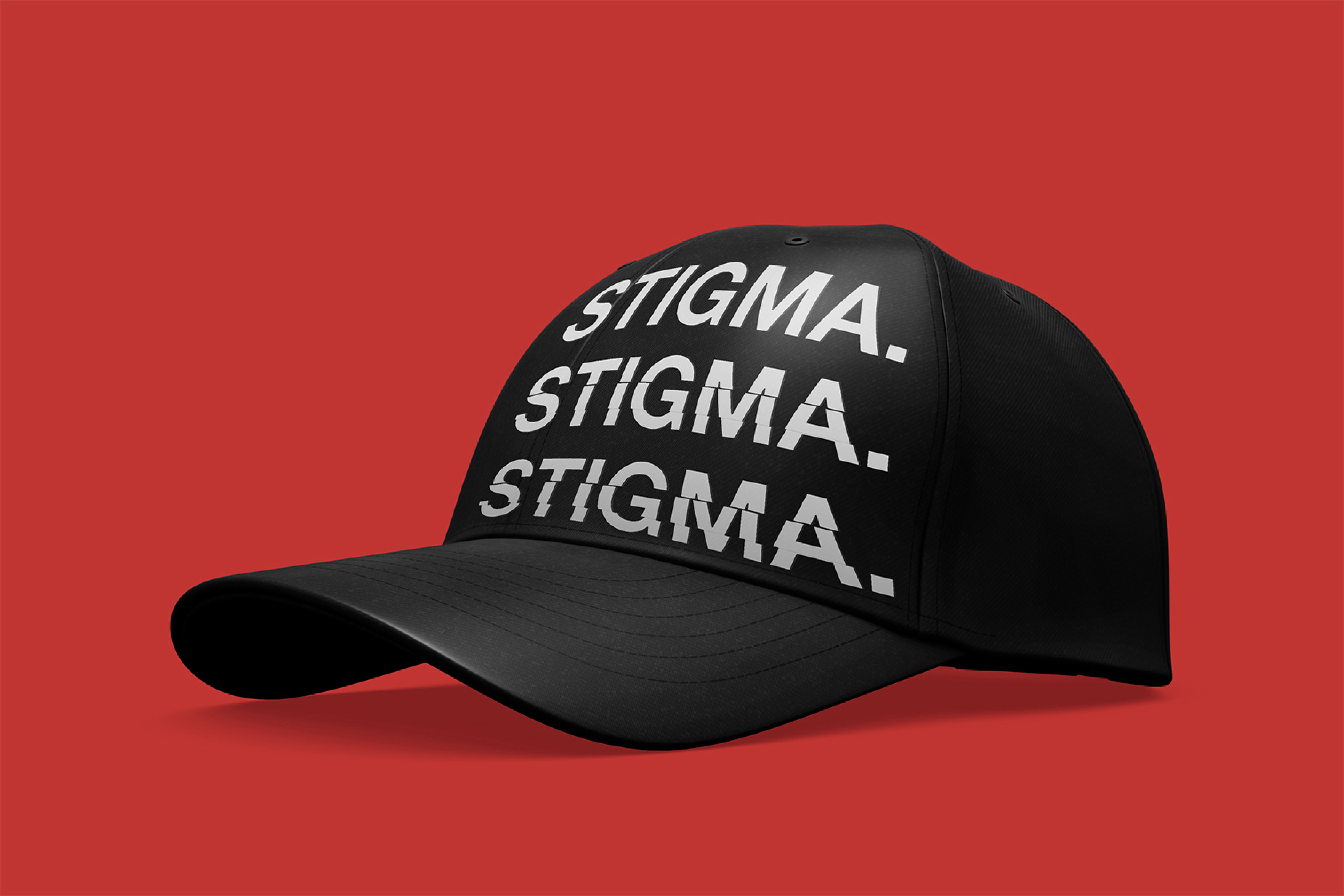
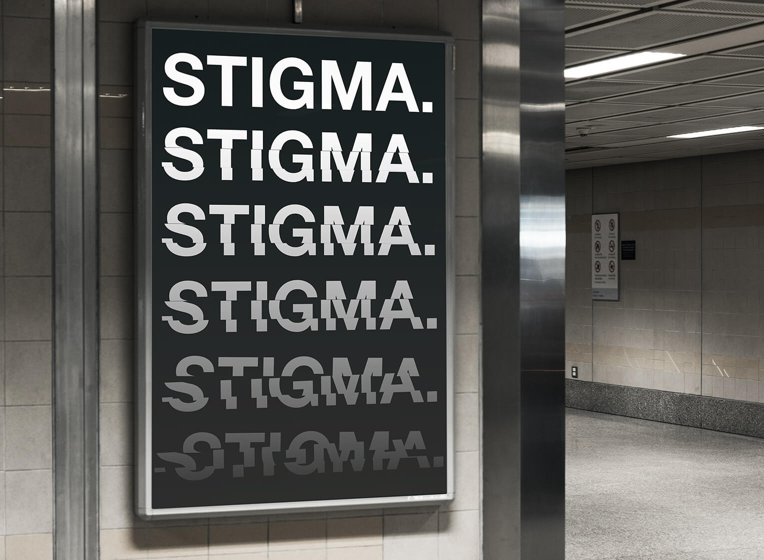
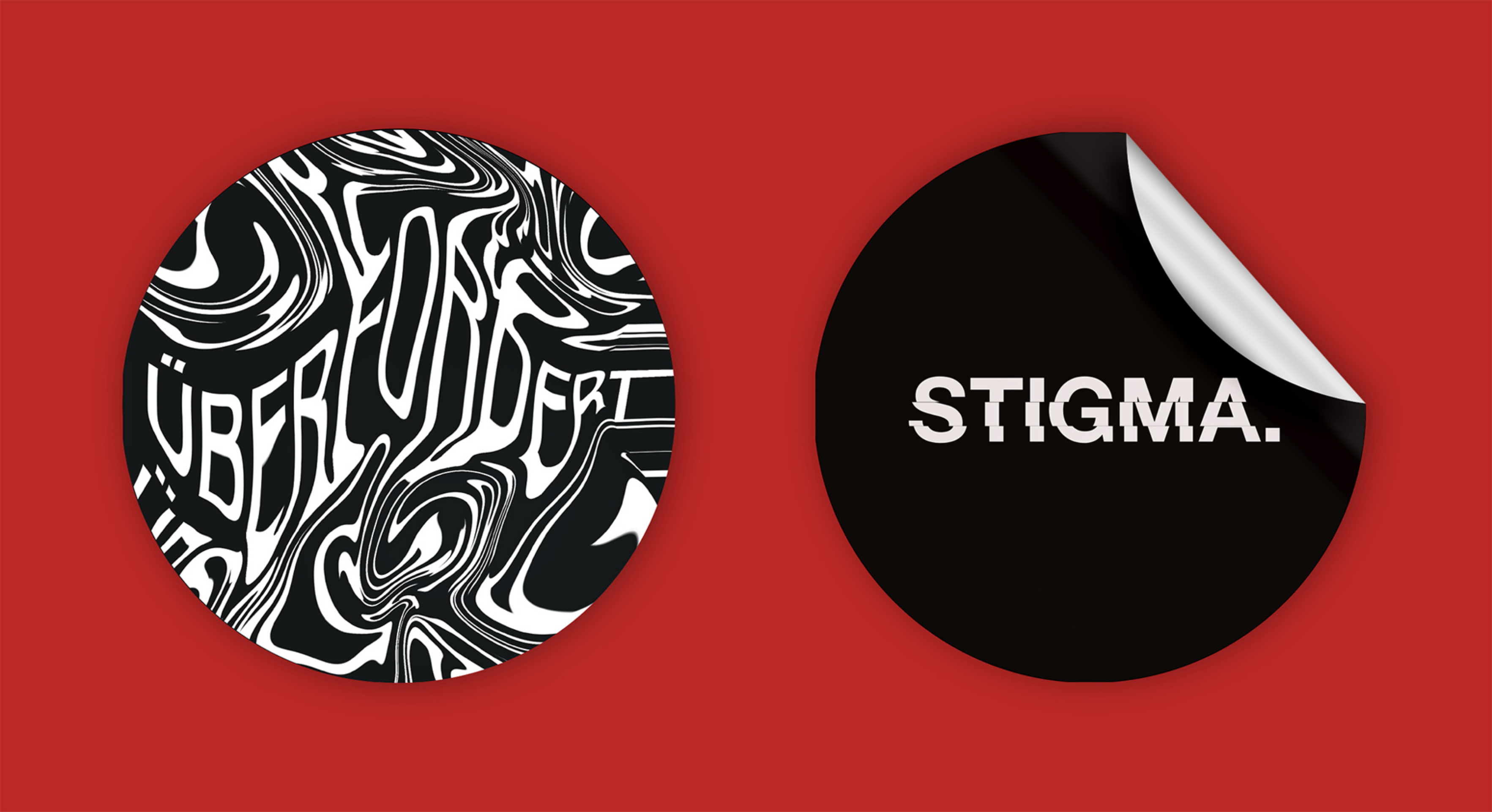
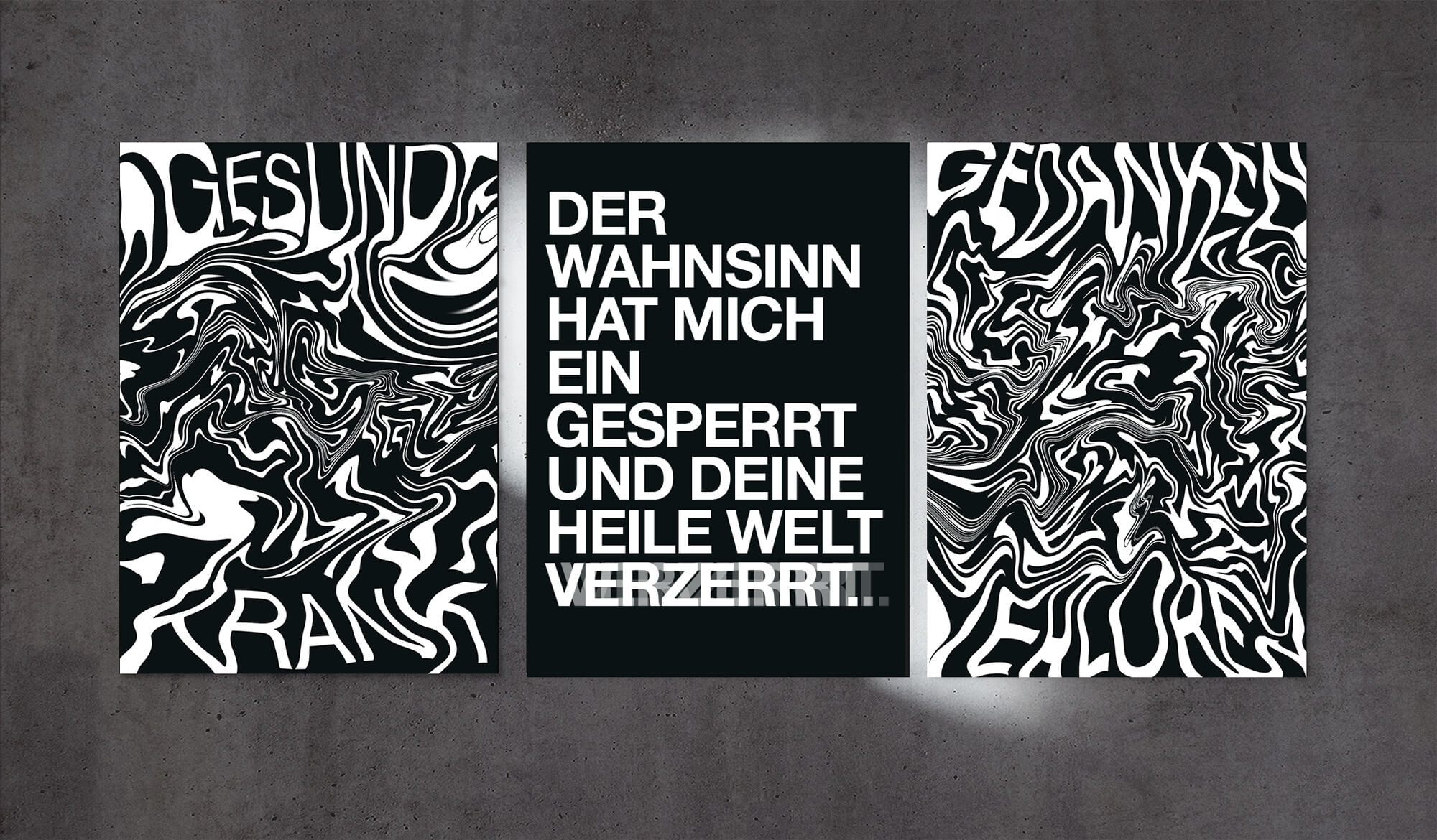
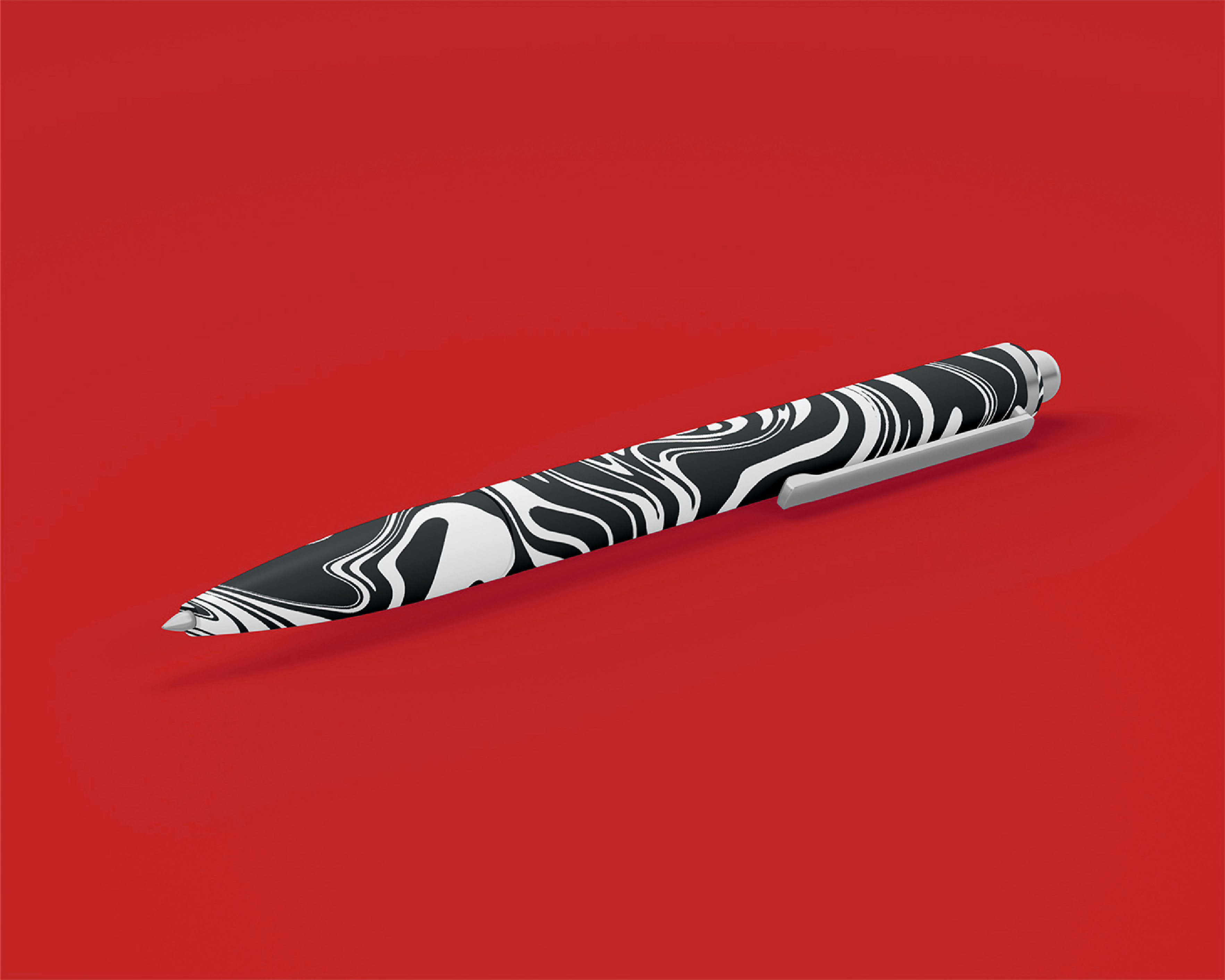
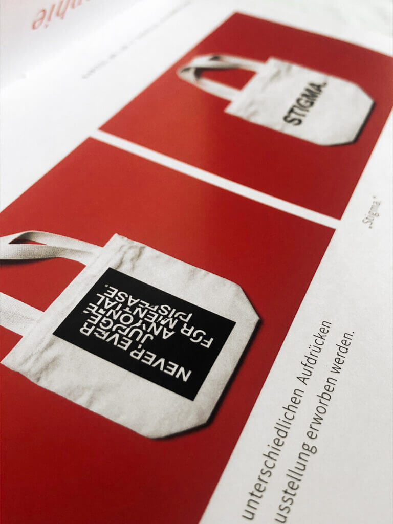
The corporate design of the exhibition reflects the problem of the social taboo and stigma regarding mental illnesses in many ways.
The color scheme is particularly rich in contrast with the achromatic colors black and white as primary tones. This combination metaphorically illustrates the black and white thinking that continues to reign in peoples minds when it comes to mental illness. In color psychology, black stands for evil, and thus stigmatization, white stands for honesty, i.e. breaking this stigmatization.
A bright orange-red takes the position as an accent color to emphasize important things. This alarming signal color breaks the yin and yang harmony of the well-known combination of black and white. It is also considered as a warning color to draw attention to this socially extremely relevant topic and to say: "Warning, I'm important!" It demands a reaction from the audience, almost screaming for attention and thus acts as an appeal to society.
The bachelor's project on the important topic of mental illnesses was only made possible through the collaboration with our wonderful colleague and friend Bettina Janisch, who acts as an illustrator and designer. Her web link: https://www.bettinajanisch.design/. She significantly contributed to the development and illustrations of the project. We really want to thank her for that.
Our team works remotely for customers worldwide. Take a look at our packages as a starting point or send us an email with your idea. We would be happy to provide you with a simple and free cost estimate for the implementation of the project.
Unerwartet Design
Belgiergasse 16 / Feuerbachgasse 9
8020 Graz, Austria
office@unerwartet.design
Mon-Fri 8.00AM-2.30PM
© 2024 Unerwartet Design