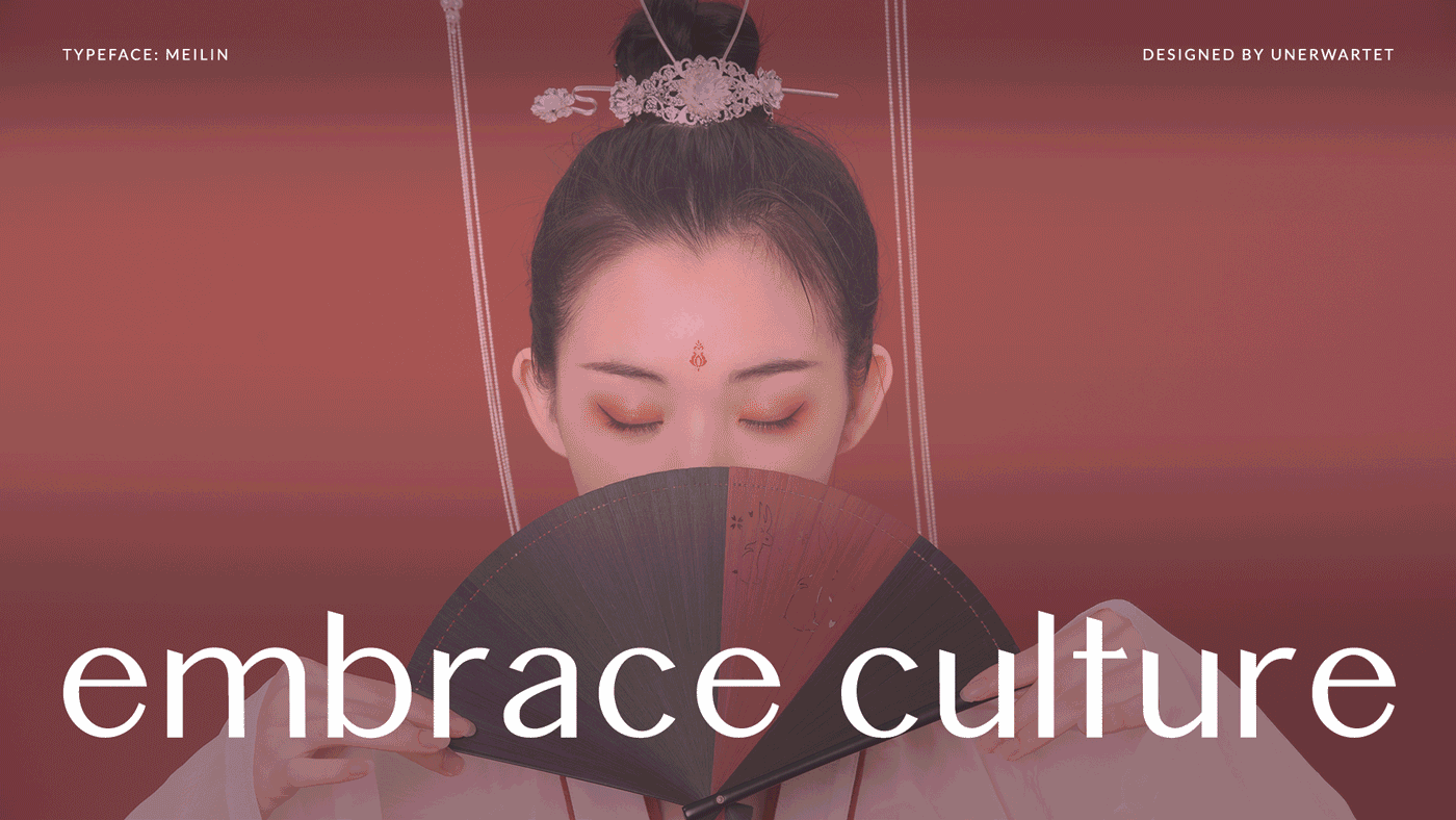
TYPOGRAPHY & EDITORIAL | GRACEFUL | ELEGANT | CULTURAL
A typeface that enhances beauty of Chinese typography.
A typeface that connects Chinese culture with typography
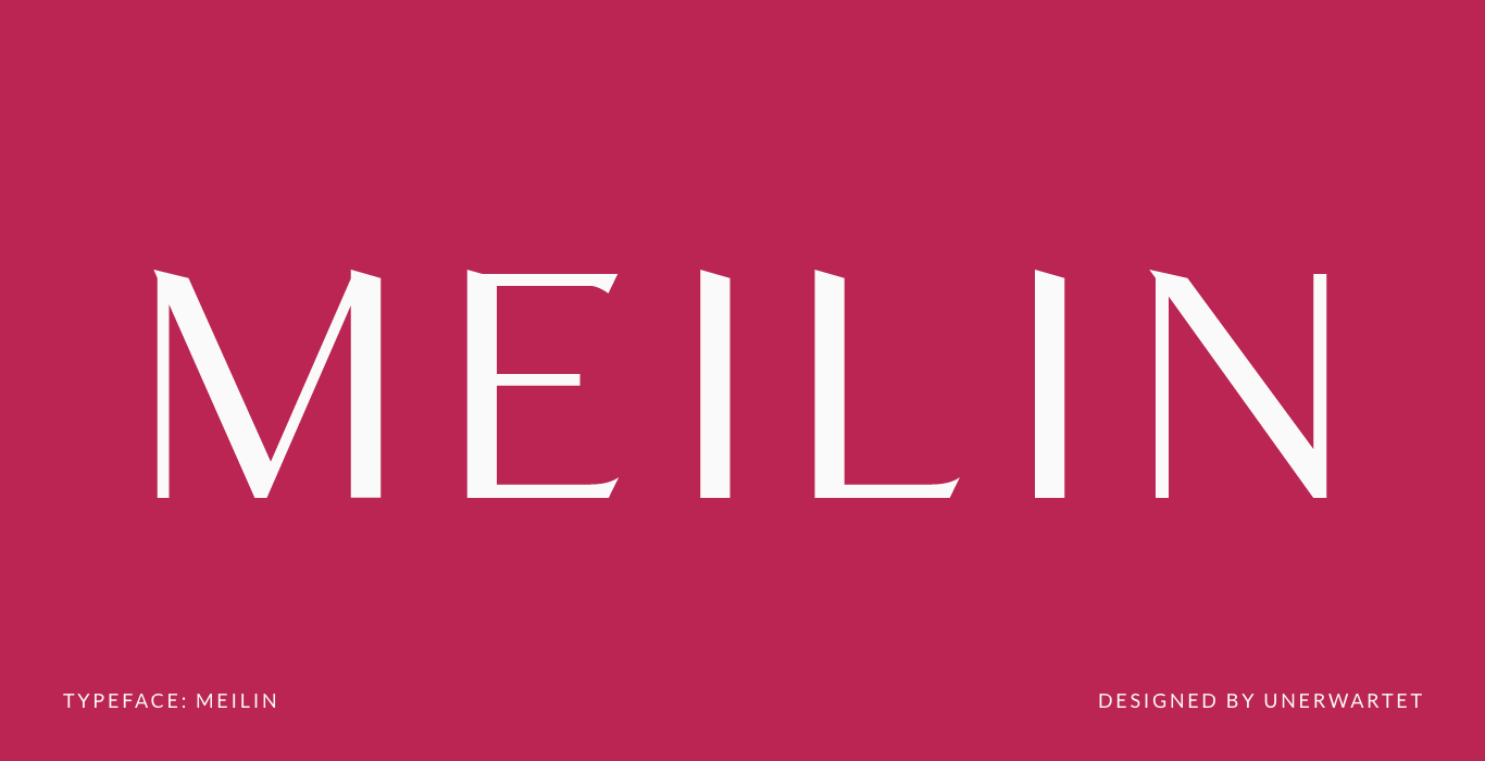
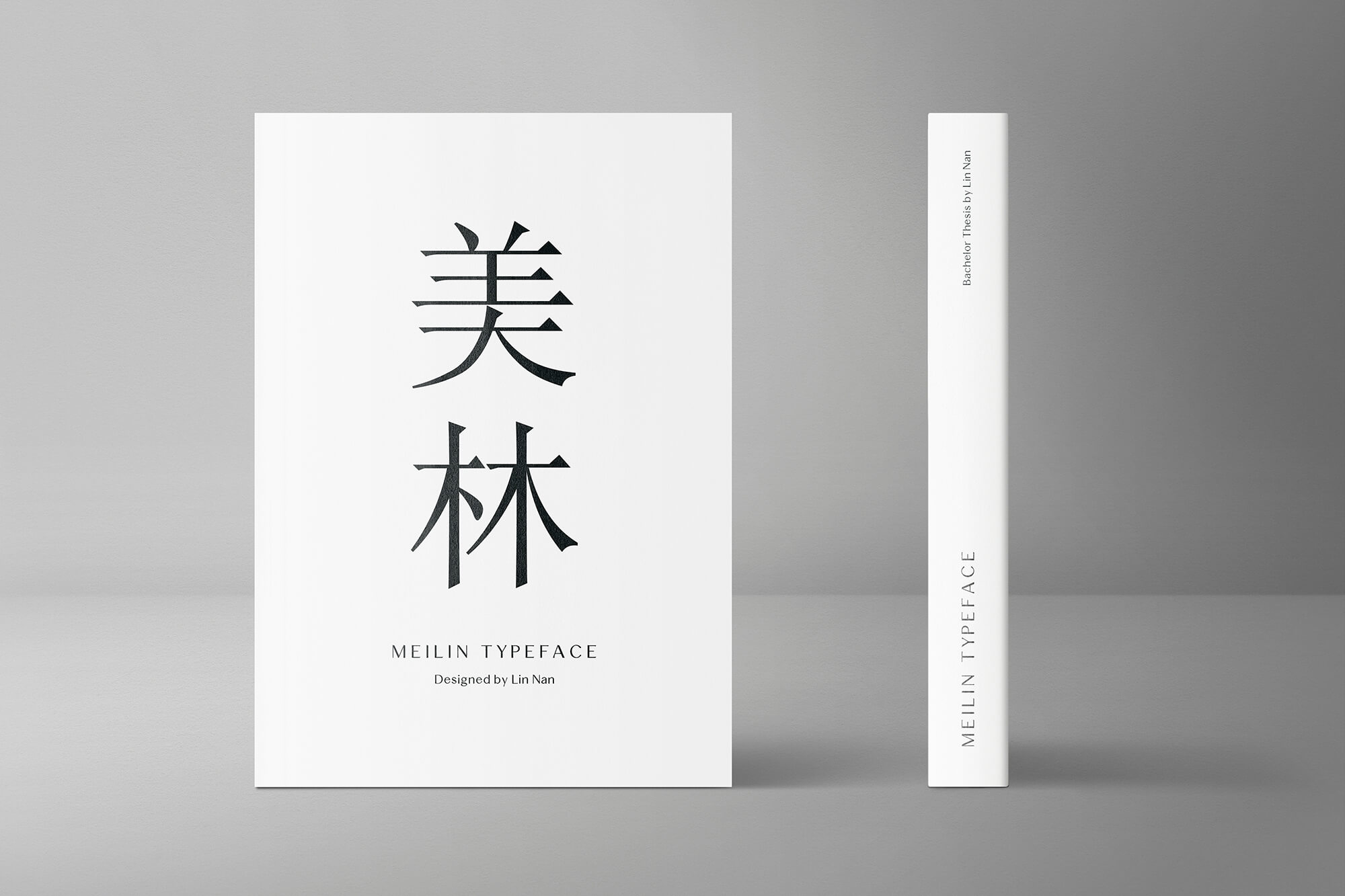
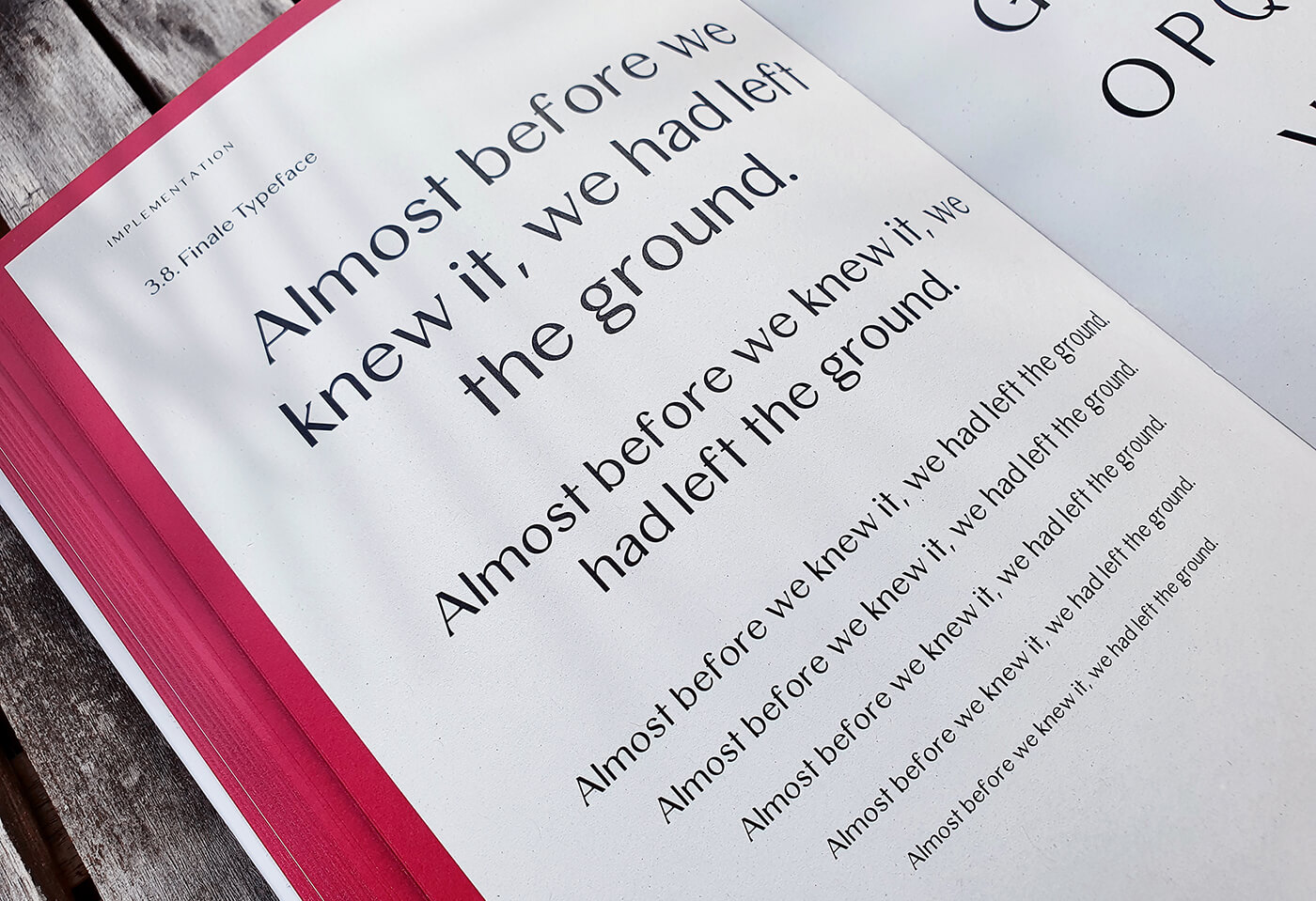
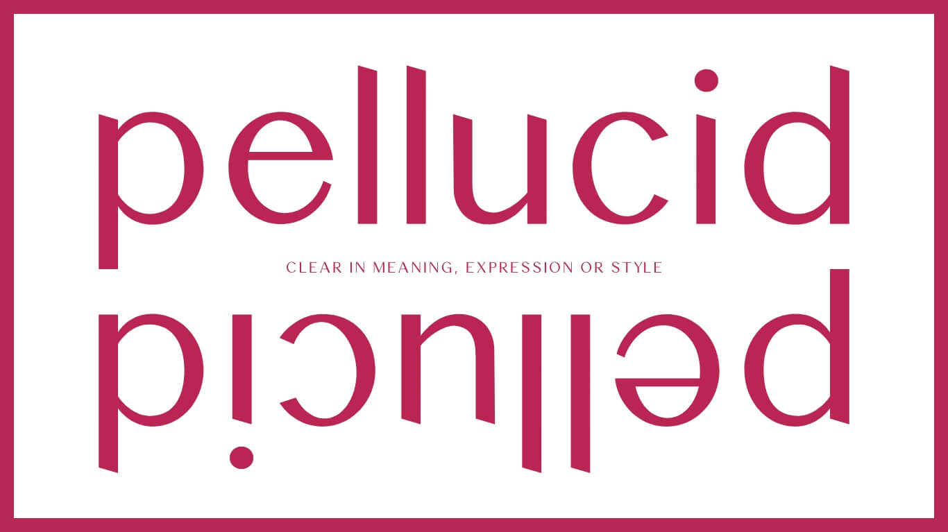
Meilin – a typeface designed utilitarian for both body text and display.
When thinking about typefaces that “look Chinese” it is hard not to picture swingy, triangular stroked letters. Due to today’s heightened vigilance towards discrimination, it can be perceived as culturally inappropriate to use these typefaces in order to create Asian-looking designs, especially when they are created and used by people with no personal ties
to any East Asian culture. Therefore, the aim of this bachelor thesis is to break the stereotype of “Asian-imitated“ fonts through the means of a modern, sans-serif typeface that is designed with considered features of Chinese typography in a reduced manner. Alternative letters with decorative features have been included to provide diverse application possibilities.
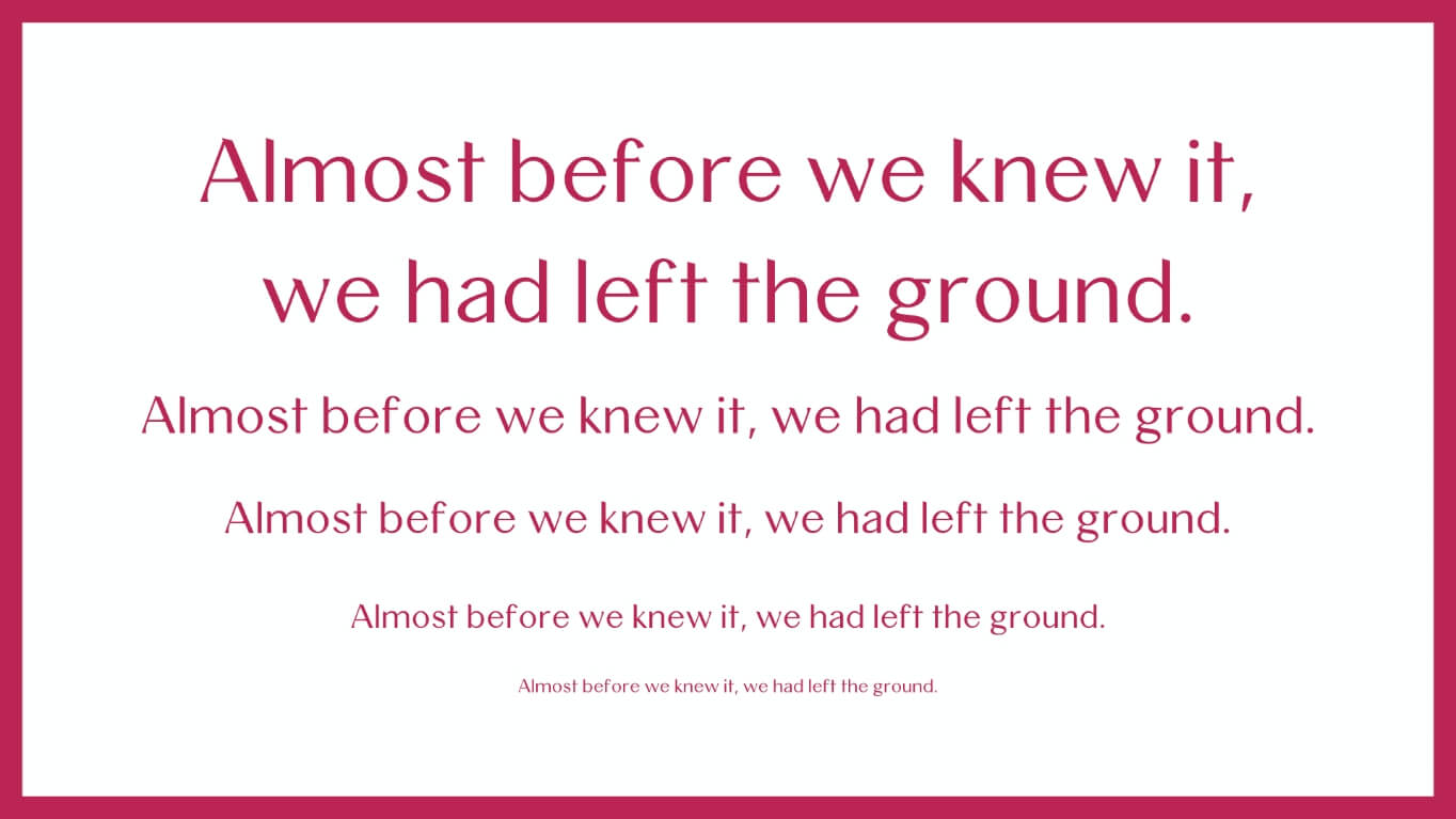
When typography is on point, words become images.
- Shawn Lukas
A font against standardization
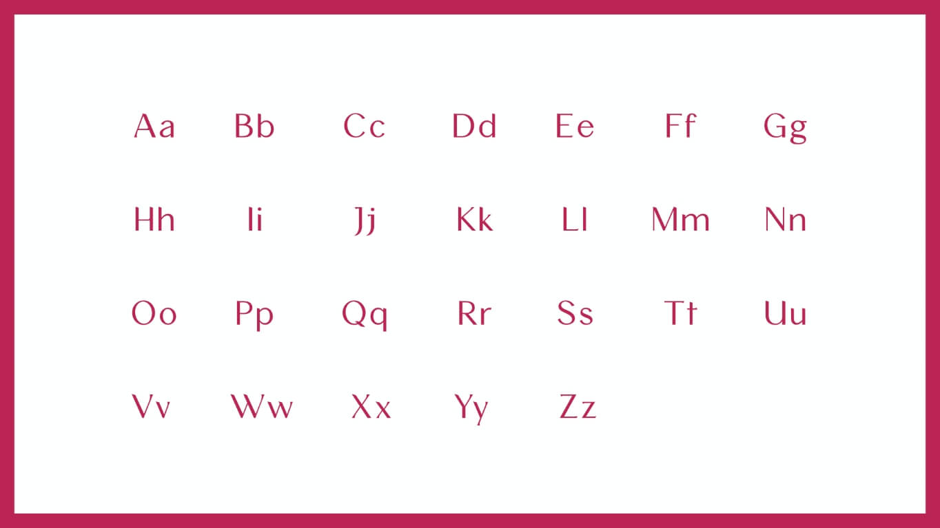
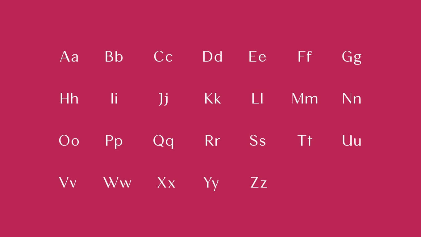
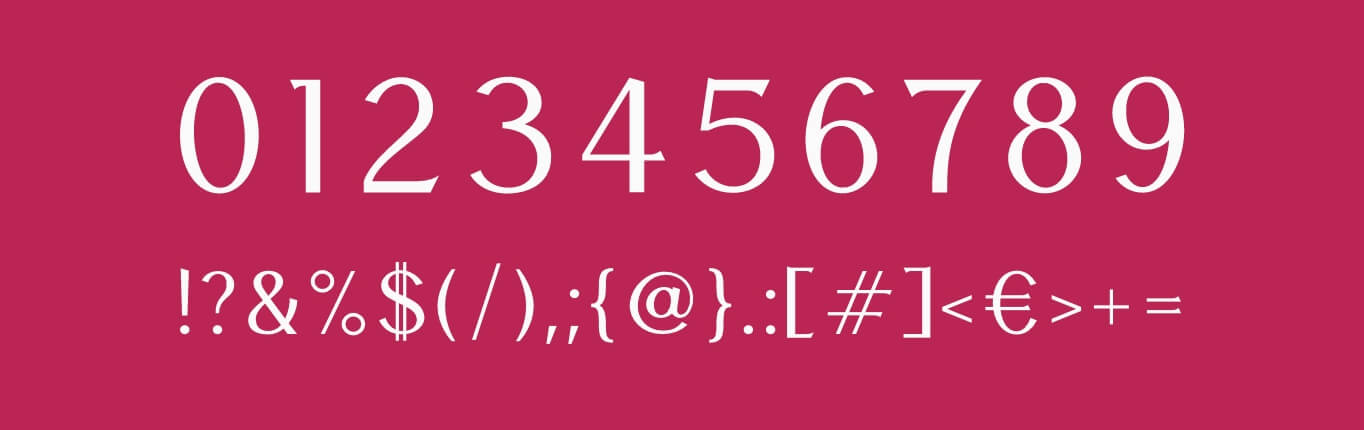
For this type design that was created as part of a bachelor thesis, the goal was to create a modern, versatile sans serif typeface for both display and body text. The unique design of Meilin should showcase calligraphic features of Chinese typography in a minimalistic way. Most importantly, Meilin should serve as an example against standardized “Chinese-looking” fonts.
Inspired by SimSun
The Chinese font which Meilin is based on is called SimSun. It is a simplified Chinese font with a decent serif stroke style created by Beijing ZhongYi Electronics Co. from 1995 to 2003. Horizontal and vertical lines are aligned in 90-degree angles while horizontal lines are thinner than the vertical ones. The lines are evenly thick with the exception of the parts where brush strokes are imitated in a geometrically reduced manner.
Meilin is a type family with a cultural twist, which combines modern Chinese typography with the minimalistic beauty of sans serif fonts that evoke elegance and strength. die moderne chinesische Typografie mit der minimalistischen Schönheit serifenloser Schriften verbindet, die Eleganz und Stärke ausstrahlen.
Due to its sharp ends and high contrast, Meilin embodies a unique personality. Ideal for headlines and branding projects that aim to subtly convey Asian beauty.
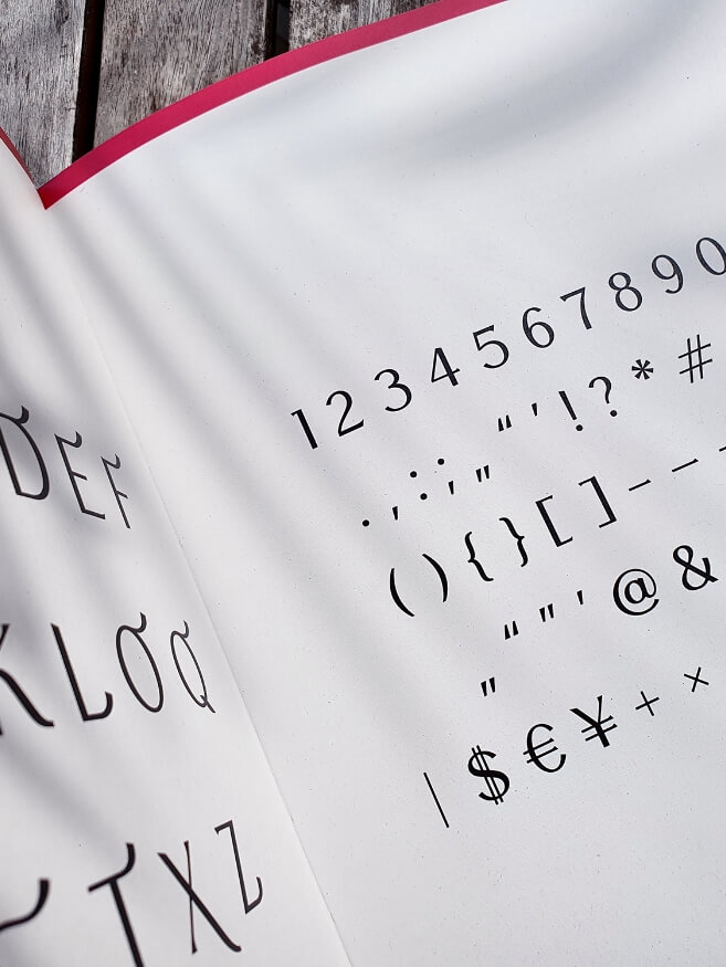
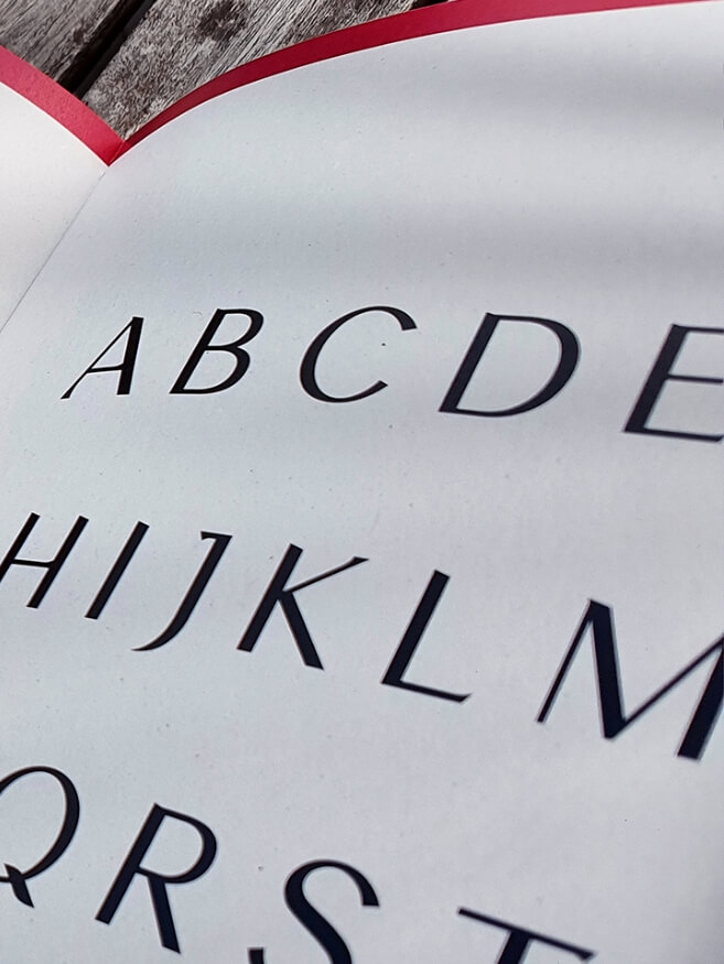
The Meilin typeface will have italic, medium, bold, semibold and a set of alternative styles.
Inspired?
Our team works remotely for customers worldwide. Take a look at our packages as a starting point or send us an email with your idea. We would be happy to provide you with a simple and free cost estimate for the implementation of the project.